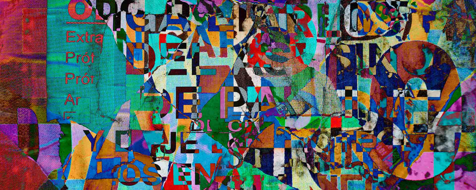
Typography’s Beauty Of Styles, Parallels, Contrasts, & Harmonies
Typography, the art of arranging typefaces, is a powerful tool that breathes life and personality into written communication. It encompasses a diverse range of styles, each possessing its unique characteristics and visual language. Today, I embark on an enlightening journey through typography, examining its various types, uncovering their similarities, differences, and exploring the art of complementing different styles.
Serif Typography
Serif fonts are distinguished by the small decorative strokes, called serifs, attached to the ends of letters. These fonts exude a timeless and elegant aura, making them popular in formal contexts such as books, newspapers, and corporate identities. The serifs guide the reader’s eye along the text, enhancing legibility and creating a sense of continuity. Classic serif typefaces include Times New Roman, Garamond, and Baskerville.
Sans-serif Typography
In contrast to serif fonts, sans-serif typefaces do not possess decorative strokes. They exhibit a clean, modern, and minimalistic aesthetic, making them suitable for digital interfaces, signage, and contemporary designs. Sans-serif fonts are highly legible, particularly in smaller sizes, and convey a sense of simplicity and efficiency. Prominent examples of sans-serif typefaces include Helvetica, Arial, and Futura.
Script Typography
Script fonts imitate the flowing nature of handwriting and calligraphy, evoking a sense of elegance, creativity, and personal touch. These fonts are often utilized in invitations, logos, and artistic designs to add a touch of sophistication and charm. Script typography spans a broad spectrum, from formal and ornate scripts to casual and playful handwritten styles. Popular script typefaces include Brush Script, Lobster, and Pacifico.
Display Typography
Display fonts are designed to make a bold statement and captivate attention. They possess various styles, including slab serifs, art deco, and grunge-inspired letterforms. Display typography finds its place in headlines, logos, and eye-catching posters, emphasizing creativity and originality. These fonts often exhibit exaggerated proportions, intricate details, and unique personalities. Notable display typefaces include Impact, Bebas Neue, and Blackletter.
Handwritten Typography
Handwritten fonts capture the essence of human touch and individuality. They emulate the imperfections and nuances of pen or pencil strokes, offering designs a personal and authentic feel. Handwritten typography is commonly used in informal contexts, such as greeting cards, blogs, and personal branding. Fonts like Comic Sans, Marker Felt, and Noteworthy exemplify the charm of handwritten styles.
Similarities
While each typography style possesses distinct characteristics, they share commonalities that underpin their purpose and effectiveness. All typography styles strive to effectively communicate messages, convey moods or tones, and enhance overall design aesthetics. Furthermore, they all adhere to fundamental principles such as legibility, kerning (adjusting the spacing between characters), and tracking (adjusting the spacing between all characters in a word or block of text). These shared foundations ensure clarity and coherence in typography across styles.
Differences
Typography styles diverge in visual appearance, historical influences, and specific usage areas. Serif and sans-serif fonts, for instance, differ in formality, with serifs often conveying a sense of tradition and authority. At the same time, sans-serifs exude a modern and clean aesthetic. Script typography stands out due to its cursive and ornate qualities, enabling it to evoke elegance and creativity. Display typography, on the other hand, thrives on its ability to capture attention through unique and visually striking designs. Handwritten typography adds a personal touch and authenticity that distinguishes it from different styles.
Complements
Rather than existing in isolation, different typography styles often work harmoniously to create visually appealing and balanced designs. Combining serif and sans-serif fonts can create an interesting contrast, with serifs lending a touch of sophistication and tradition while sans-serifs provide a contemporary twist. Script and display fonts can complement each other by offering distinct styles that draw attention and add visual interest. Handwritten fonts can be used sparingly to inject a personalized emphasis into specific design elements, creating focal points and adding warmth.
Typography is an art form that possesses boundless potential for expression. By understanding the various types of typography, their similarities, differences, and the art of complementing different styles, designers can use this powerful tool to effectively convey messages, evoke emotions, and create visually captivating experiences. By exploring and experimenting with typography, we unlock the door to limitless creative possibilities in the design world.
SHARE ARTICLE
Your Brand, Elevated.
Be The Brand Everyone Talks About.
The Next Big Win Starts Here.